Why the “Product Identity Card” Became One of 2026’s Smartest Tea-Menu Formats: Looking at CHAGEE’s Front-End Copy, Brands Are Turning Recipe Notes into Consumer Language
Published: · Updated:
If the earlier phase of tea-menu upgrading was mainly about making broad phrases like “low sugar,” “lighter burden,” “real tea base,” and “less added” sound smoother and more persuasive, then by 2026 a more specific shift has emerged. Some brands are now using the phrase “product identity card” as a public-facing menu format. It is not just there to describe flavor. It is there to break a drink down into recognition points that consumers can grasp quickly—and then repeat to someone else.
This deserves its own article not because the phrase “identity card” is clever on its own, but because it pushes menu language one step further. Older product pages mostly told you what style a drink belonged to: fresher, more fragrant, richer, lower-burden. What we are seeing now is a more explicit front-end structure: the page tells you what the tea base is, where the fruit note comes from, what supports the texture, and even why the drink should be read through terms like hydration, floral lift, orchid-like character, or rocky depth. Once that information is fixed into a reusable copy module, the menu stops being a loose pile of selling points and starts becoming a way of training consumers how to read a drink.
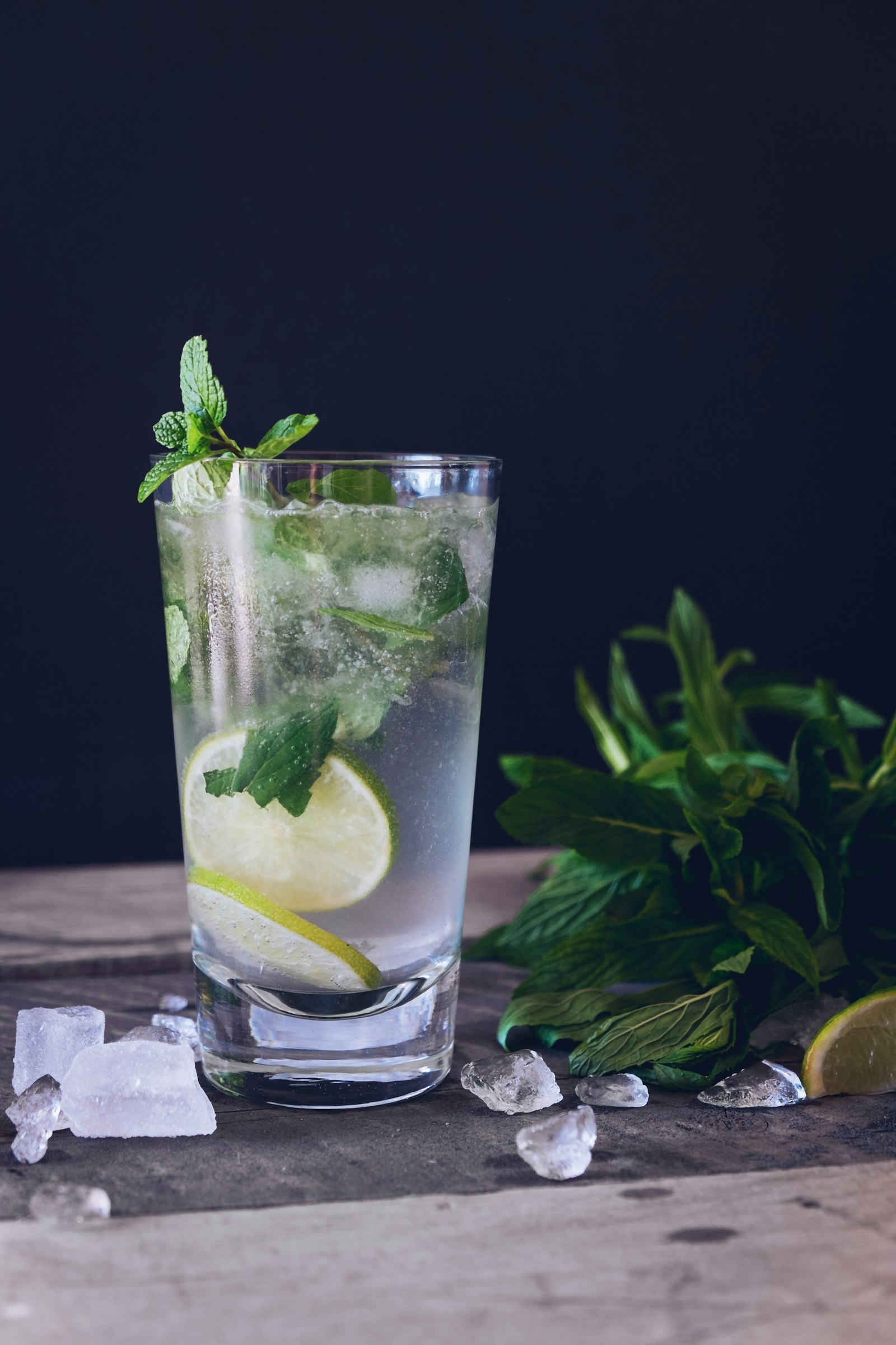
CHAGEE’s recent product pages show this especially clearly. Whether the drink is Yangzhi Ganlu, Coconut Water, Guanyin Coconut, Jasmine Coconut, Sea Salt Electrolyte Lemon Tea, Cooling Factor Lemon Tea, Grape Jade, or Qili Xiang, the page repeatedly uses the label “product identity card,” then places tea base, fruit note, texture, and functional-emotional cues side by side. What this does is not only increase clarity. It rewrites the question of “who this drink is” into a format that is easier to circulate on the Chinese internet.
Once brands place a “product identity card” directly into the front-end page, the menu is no longer just there to help with ordering. It starts teaching consumers how to remember a drink.
1. What exactly is a “product identity card”? It is not just a metaphor, but a menu format
At first glance, many people may read “product identity card” as just another decorative marketing phrase. But the important part is not the metaphor. It is the format. In practice, a “product identity card” compresses information that used to be scattered across naming, ingredient notes, mouthfeel description, and scene-setting language into a single recognition unit that consumers can identify at a glance. It turns a drink from a vague question of “does this seem tasty?” into a quick-reading object built around key components.
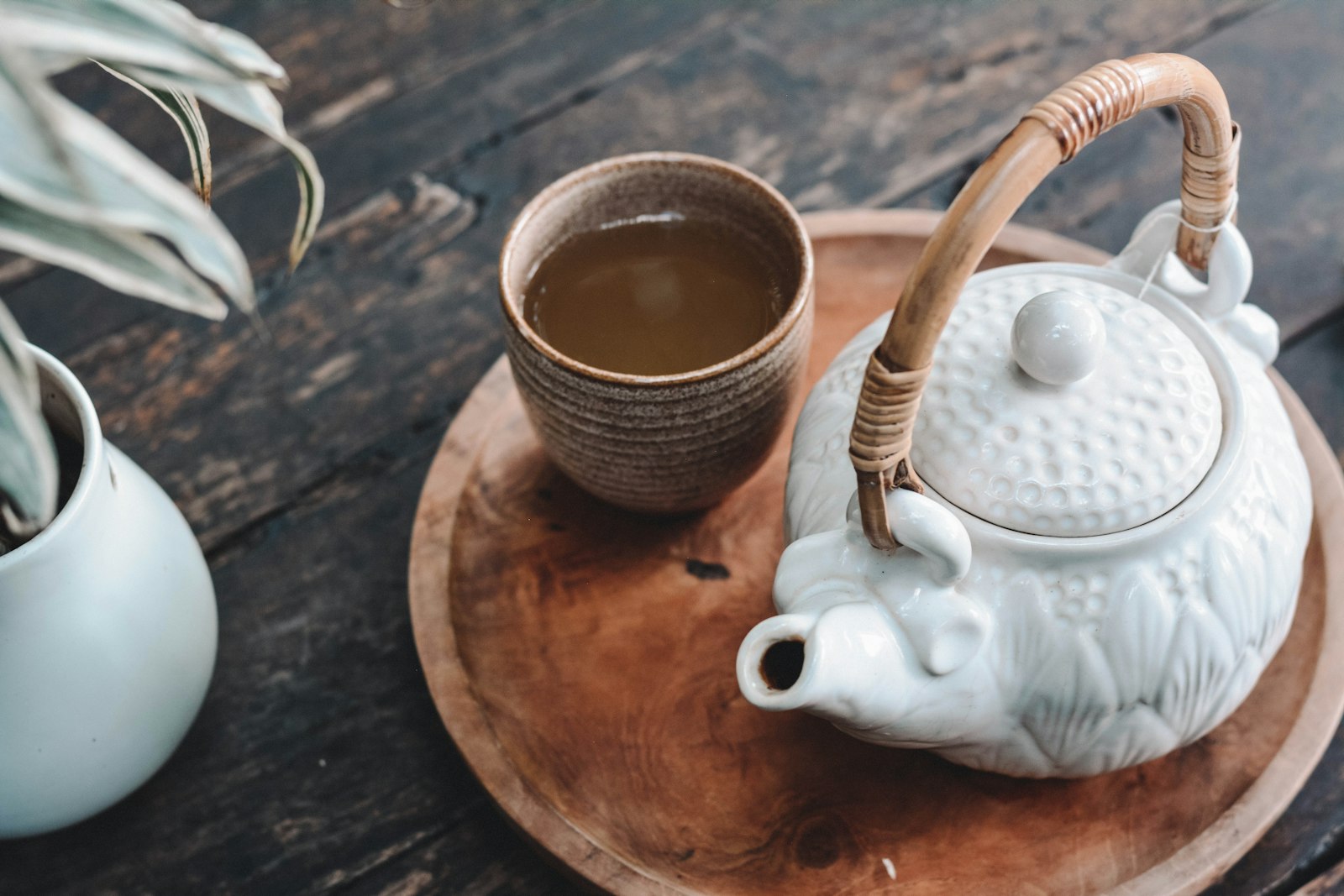
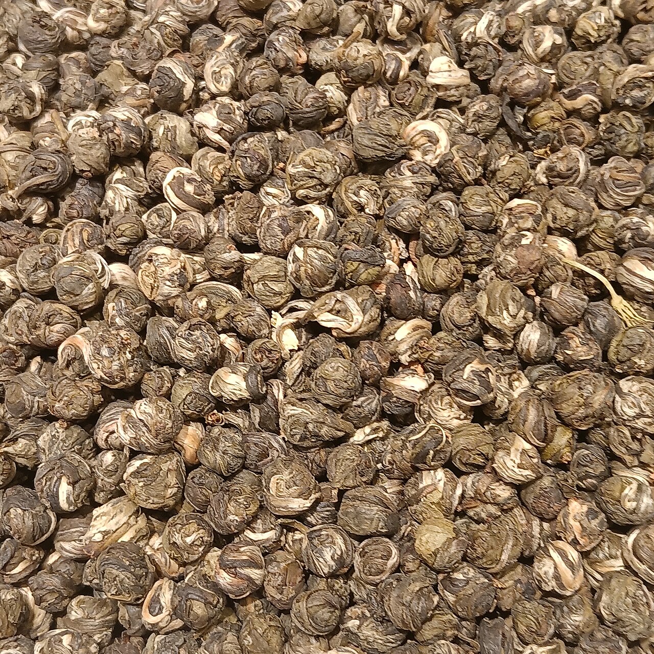
That is what separates it from an ordinary product description. Instead of writing a few loose lines of praise, it tries to provide a skeleton that can be repeated. The tea base might be jasmine snow buds, Tieguanyin, mountain oolong, or Da Hong Pao. The fruit note might be mango, grape, lemon, or orange slice. The texture may be supported by shaved ice, cheese foam, white-jade pearls, or coconut water. Then the page adds a layer of consumer-facing language such as hydration, freshness, floral lift, or clear aftertaste. The result is that consumers no longer understand the drink only as “this looks nice,” but as “this is a certain tea base combined with a certain fruit, coconut, or texture structure.”
That shift matters because it translates recipe thinking into consumer thinking. Internally, brands have always known how a drink is built. But much of that information used to stay inside R&D, staff training, or store operations. Once it is organized as a “product identity card” and pushed to the front end, the brand is effectively saying: you are not just here to pick a random drink. You can also read this cup like a card and quickly judge its character, structure, and difference.
The “product identity card” reorganizes what used to feel like back-end information—tea base, structure, flavor direction—into front-end content consumers can read directly.
2. Why now? Why are brands suddenly writing product pages in this “identity card” style?
Because generalized selling points are no longer enough. For the past few years, the most common front-end language in tea drinks has been low sugar, lighter milk, whole leaf, real tea base, less added, and lower burden. These terms have not failed. They still matter. But they now look more like infrastructure. Once everyone says them, they remain necessary without being distinctive. Consumers understand the message, but they do not necessarily remember what exactly you are selling.
The “product identity card” fills that gap. It is more specific than “healthier,” easier to verify than “tastier,” and more complete than simply naming a tea base. It does not only tell you that a drink contains Tieguanyin. It tells you how Tieguanyin fits together with fresh coconut water, white-jade pearls, honey-floral notes, and a refreshing texture logic inside one coherent product frame. In other words, the brand is not only trying to reveal ingredients. It is trying to help consumers form a faster mental outline of the drink.
That is also why this format fits the 2026 market especially well. Consumers have already learned just enough. They may not be professionals, but they now understand that jasmine, Guanyin, oolong, lemon, coconut water, and cheese foam imply different directions. The next stage of competition, then, is no longer merely to teach that differences exist. It is to organize those differences into a structure that is clearer, lighter to process, and easier to remember. Whoever does that best is more likely to win repetition and recall.
3. Why is CHAGEE’s use of the “product identity card” especially worth analyzing?
Because it is not a one-off flourish. It has become a systematic front-end writing method. On CHAGEE’s site, the phrase does not serve only one flagship SKU. It recurs across multiple product lines. That repetition matters, because it suggests not an isolated creative choice but a unified method. And unified methods are powerful because they slowly change how consumers read.
On fruit-tea and light-fruit-tea pages, for example, Yangzhi Ganlu is no longer just “a mango-coconut style drink.” It is broken down into a mango base, Tieguanyin integration, shaved-ice structure, and coconut layering. Coconut Water is not sold only as generic tropical refreshment, but linked to natural electrolytes, hydration, and a lighter-burden narrative. Guanyin Coconut and Jasmine Coconut connect fresh coconut water respectively to Tieguanyin and jasmine snow buds, making the tea base itself part of consumer cognition. Sea Salt Electrolyte Lemon Tea and Cooling Factor Lemon Tea likewise do not live on the phrase “lemon tea” alone. Their front-end copy adds layers such as sea salt, electrolytes, cooling factor, and jasmine snow buds or green tea.
More importantly, this style covers flavor, structure, and mood at once. It is not a dry list of parameters. It translates parameters into language consumers are willing to absorb: bright, floral, orchid-like, lingering sweetness, hydrating, low-burden, refreshing, popping, dense. That is exactly why the “product identity card” works better than an ordinary formula explanation. It keeps the structure without losing consumer imagination.
Once names like jasmine snow buds, Tieguanyin, and Da Hong Pao are repeatedly written into public-facing copy, menus are actively teaching consumers to remember who the tea is.Even ordinary lemon tea is now less likely to be described only as sweet-sour and refreshing. It is increasingly broken into tea base, functional cue, and texture structure.
4. How is this different from ingredient transparency? Related, yes—but not the same thing
Ingredient transparency is about trust. It asks whether the brand has clearly explained what is in the drink, reduced opacity, and avoided hiding behind vague concepts. The “product identity card” is about recognition. Once you are already willing to explain things clearly, can you also explain product difference in a way that is easier to remember and compare? The first asks, “what did you put in this?” The second asks, “so who exactly is this drink?”
The two often overlap, but they do different jobs. Without transparency, identity-card copy can feel empty. With transparency alone and no recognition layer, consumers may still feel every brand sounds broadly similar. The strongest menu language today is not one or the other. It links them: make the consumer feel that nothing is being concealed, while also making the drink feel like it has a face of its own.
Seen this way, the “product identity card” is a sign that tea-drink language is moving from baseline competition to higher-order competition. The baseline is: do not mislead me. The advanced level is: make me remember you. The second is obviously harder, because it requires not only clarity, but clarity that still carries distinction.
5. Why is this format especially suitable for the Chinese internet?
Because it is naturally easy to screenshot, repeat, compare, and mock. One of the Chinese internet’s favorite kinds of content is exactly this sort of consumer knowledge: slightly specialized, but not too difficult to grasp. Once a drink is written as “Tieguanyin + fresh coconut water + white-jade pearls + orchid note + refreshing finish,” it instantly creates entry points for discussion. Some people will find it elegant. Some will feel it finally explains the drink. Some will ask whether it is only a way of making an ordinary beverage sound more complicated.
And for the brand, those reactions are not necessarily bad. The moment people begin repeating the same structure, that structure has already entered public language. The worst outcome is not criticism. It is non-repeatability. Many older product pages contained plenty of text, but left behind no memorable frame. The advantage of the “product identity card” style is that it pre-builds the repeatable part.
That is also why it spreads better than a generic claim of “tasty.” You usually need to drink something before judging that. A “product identity card,” by contrast, lets people form expectations before tasting. And expectation is itself content fuel: it encourages discussion, comparison, forwarding, and eventually cross-brand comparison around whether everyone is beginning to write through the same template.
The format spreads well because it lets consumers form structured expectations before drinking—and those expectations are exactly what open the door to discussion.
6. Is it still packaging? Of course. But the real question now is whether that packaging can be tested
Of course there is packaging involved. Any move that makes a drink sound fuller, cleaner, or more structured carries a commercial purpose. But what is interesting now is that the more structured the packaging becomes, the easier it is for consumers to test. If you only say a drink is “delicious,” people cannot really argue. The moment you write tea base, mouthfeel, flavor direction, and freshness logic into a “product identity card,” you give consumers clearer coordinates for judgment.
That means the format may be introduced by brands, but it is not fully controlled by them. The Chinese internet immediately takes over. People compare stores, test whether the copy matches the flavor, and ask whether formula explanation has simply been turned into a new marketing grammar. The more specific the writing becomes, the more it can amplify real difference—but also expose hollowness.
So the real thing worth watching is not whether brands keep using the phrase “product identity card.” It is whether the format survives experience. If copy and product line up, the method can harden into brand asset. If most people end up feeling that the page is full while the drink is ordinary, the structure will quickly be seen through and mocked as another empty template.
7. Why is this worth following long term in the drinks section?
Because this is not about one breakout SKU. It is about a structural change in menu writing. We have already written about tea-base identity, floral language, coconut as a base note, lighter milk tea, and ingredient transparency. The “product identity card” looks like a format that gathers many of those scattered trends into one front-end frame. It makes tea base, fruit note, hydration cue, floral lift, orchid character, and texture structure stop speaking separately and start appearing inside one readable explanation card.
Once more brands adopt this format, the market’s comparison habits will change with it. People may stop talking only about sweetness or value and start asking more naturally: does the tea base get explained clearly? Is the structure of the drink actually legible? Does it really have an “identity card” that makes sense in both writing and flavor? That shift would directly change how consumers read menus and how brands write them.
From a larger perspective, it also shows that tea drinks are continuing to modularize, template, and front-load product narrative. Templating is not automatically bad. Empty templates are bad. Good templates raise the density of public expression and teach more people to distinguish drinks through finer language. As long as that distinction keeps happening, the drinks section will keep having worthwhile details to follow.
That is why I see the “product identity card” as a key marker in the 2026 upgrade of tea menus. It suggests that brand competition is no longer satisfied with making tea drinks sound healthy, light, or tasty. It is increasingly about who can write a drink as a front-end explanation card that people remember, repeat, compare—and test.